More than 53 percent of global internet traffic is now mobile, forcing community organisations in Sydney and across British territories to rethink digital engagement. Responsive design is not just a technical upgrade—it is about delivering ethical, accessible experiences for every user regardless of device. This article reveals practical strategies for aligning your organisation’s online presence with both modern web standards and community-driven ethical values, ensuring user engagement thrives across diverse screens.
Table of Contents
- Responsive Design Basics For Modern Web Use
- Key Principles And Technologies Explained
- Accessibility And Inclusive Experience Standards
- Ethical, Sustainable, And Legal Considerations
- Common Pitfalls And SEO Performance Issues
Key Takeaways
| Point | Details |
|---|---|
| Responsive Design Is Essential | It ensures websites function well across various devices, maintaining user experience and accessibility. |
| Key Technologies Include Fluid Grids and Media Queries | These tools provide adaptability in layout and content presentation, crucial for performance and SEO. |
| Accessibility Must Be Prioritised | Implementing WCAG guidelines fosters inclusivity and ensures compliance with legal standards. |
| Regular Testing and Audits Are Vital | Conducting performance and accessibility audits helps identify issues before they impact user experience and search rankings. |
Responsive Design Basics for Modern Web Use
Responsive web design represents a fundamental approach to creating digital experiences that seamlessly adapt across different devices and screen sizes. At its core, this design philosophy ensures websites function effectively whether viewed on a desktop computer, tablet, or smartphone. The goal is providing consistent, high-quality user interactions regardless of technological context.
Modern web standards increasingly emphasise adaptability, with accessibility frameworks from Australian guidelines highlighting how responsive design supports inclusive digital experiences. Community brands must recognise that user experience transcends traditional screen boundaries. This means designing websites that automatically resize, reformat, and restructure content to maintain readability and functionality across diverse technological platforms.
Key responsive design principles include flexible grid layouts, scalable images, and adaptive typography. These technical elements work together to create websites that dynamically respond to different device characteristics. Breakpoints allow designers to specify how layouts should transform at specific screen width thresholds, ensuring content remains legible and navigable whether viewed on a small mobile screen or a large desktop monitor.
Pro tip: When developing responsive designs, always test your website across multiple devices and screen sizes to guarantee a consistent user experience.
Key Principles and Technologies Explained
Responsive web design relies on several fundamental technologies and principles that enable seamless digital experiences across multiple devices. Fluid grids form the foundational framework, allowing website layouts to dynamically adjust and proportionally resize based on screen dimensions. These grid systems use percentage-based measurements instead of fixed pixels, creating flexible containers that adapt intelligently to different viewing environments.

Digital systems design principles from Australian curriculum guidelines emphasise the importance of creating adaptable technological solutions. For community brands, this means implementing media queries – critical CSS techniques that detect device characteristics and apply specific styling rules accordingly. Media queries enable websites to fundamentally restructure content, resize images, and reformat navigation elements based on screen width, orientation, and resolution.
Beyond technical implementation, responsive design incorporates sophisticated typography and image scaling strategies. Designers use relative units like "emandrem` for font sizes, ensuring text remains readable across devices. Similarly, images are configured to scale proportionally, preventing distortion or unnecessary bandwidth consumption. Modern responsive techniques also leverage emerging technologies like CSS Flexbox and CSS Grid, which provide even more sophisticated layout control and device compatibility.
Pro tip: Prioritise performance alongside responsiveness by compressing images and minimising complex CSS to ensure fast loading across all device types.
The following table summarises the main responsive design technologies and their specific roles:
| Technology | Primary Purpose | Business Impact |
|---|---|---|
| Fluid Grids | Enable flexible layout scaling | Ensures consistency across devices |
| Media Queries | Apply styles based on device characteristics | Improves user experience and SEO |
| Flexbox & CSS Grid | Advanced, adaptive layout control | Simplifies complex interfaces |
| Scalable Images | Optimise image display for all screens | Reduces load time; saves bandwidth |
| Relative Typography | Maintain readable text on any device | Enhances accessibility and clarity |
Accessibility and Inclusive Experience Standards
Accessibility in responsive web design transcends technical implementation and represents a fundamental commitment to creating digital experiences that welcome all users. Web Content Accessibility Guidelines (WCAG) provide a comprehensive framework for ensuring websites are perceivable, operable, understandable, and robust across diverse user needs and technological capabilities.
Accessibility standards outlined by Australian policy frameworks mandate specific requirements for inclusive digital experiences. These guidelines require community brands to implement design strategies that support users with varying abilities, including those using assistive technologies. Critical considerations include providing alternative text for images, ensuring keyboard navigation, maintaining sufficient colour contrast, and designing interfaces that can be interpreted by screen readers.
Responsive design intersects directly with accessibility by creating flexible layouts that adapt not just to screen sizes, but to different interaction modes. This means developing websites that function seamlessly whether users navigate via mouse, touchscreen, keyboard, or specialised assistive devices. Semantic HTML structures, appropriate heading hierarchies, and clear navigation paths become essential components of creating truly inclusive digital experiences that respect user diversity and technological variability.
Pro tip: Conduct regular accessibility audits using automated tools and manual testing to ensure your responsive design meets diverse user needs and compliance standards.
Ethical, Sustainable, and Legal Considerations
Responsive web design extends far beyond technical implementation, encompassing critical ethical considerations that shape digital experiences for community brands. Modern organisations must recognise that their online presence reflects deeper commitments to social responsibility, user privacy, and sustainable digital practices.
Ethical technology design principles emphasise creating digital solutions that prioritise user welfare and community trust. This approach involves carefully considering data collection practices, ensuring transparent user consent, and designing interfaces that respect individual privacy while delivering meaningful digital experiences. Community brands must navigate complex ethical terrain, balancing technological innovation with genuine respect for user autonomy and digital rights.
Legal compliance represents another crucial dimension of responsible web design. Intellectual property considerations demand meticulous attention to copyright regulations, content ownership, and appropriate use of digital assets. Australian organisations must adhere to strict guidelines regarding data protection, ensuring that responsive design implementations do not compromise user information or inadvertently breach privacy standards. This involves implementing robust security measures, maintaining clear data usage policies, and providing users with comprehensive control over their personal information.
Pro tip: Conduct regular ethical audits of your digital platforms, reviewing design choices, data practices, and user interaction mechanisms to ensure alignment with contemporary legal and ethical standards.
Here is a comparison of accessibility requirements and legal, ethical, or performance considerations in responsive design:
| Aspect | Accessibility Focus | Legal/Ethical/Performance Focus |
|---|---|---|
| Key Guidelines | WCAG, alt text, keyboard access | Copyright, privacy, ethical audits |
| Primary Objectives | Inclusivity, usability for all users | Data security, compliance, trust |
| Risks if Ignored | Alienate users, legal penalties | Breach of law, damaged reputation |
| Testing Methods | Manual and automated audits | Regular reviews and platform checks |
Common Pitfalls and SEO Performance Issues
Responsive web design presents numerous potential challenges that can significantly impact a community brand’s digital performance. Performance bottlenecks often emerge from complex design implementations that compromise website speed and user experience, directly influencing search engine rankings and audience engagement.
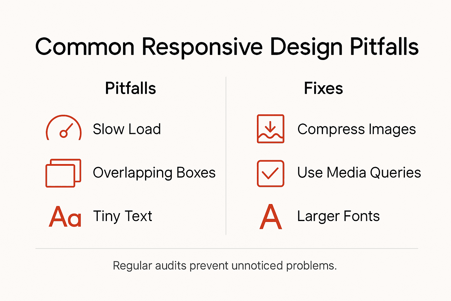
SEO techniques and website design challenges highlight critical areas where responsive design can go wrong. Common pitfalls include excessive image file sizes, inefficient code structures, and poorly implemented media queries that create inconsistent rendering across different devices. These technical shortcomings can dramatically reduce page loading speeds, increase bounce rates, and negatively affect search engine visibility.
Accessibility represents another crucial dimension of responsive design performance. Websites that fail to meet comprehensive accessibility standards not only alienate potential users but also receive penalties from search engines. Mobile responsiveness requires careful consideration of content hierarchy, touch-friendly navigation elements, and adaptive typography that maintains readability across diverse screen sizes. Complex design elements that work well on desktop can become significant barriers on smaller mobile interfaces, creating frustrating user experiences that search algorithms actively penalise.
Pro tip: Regularly conduct comprehensive performance audits using both automated tools and manual testing to identify and address responsive design inefficiencies before they impact your website’s search engine rankings.
Elevate Your Community Brand With Responsive Design That Truly Connects
Responsive design is more than a technical requirement it is a commitment to creating inclusive, accessible, and ethical digital experiences that speak to your community’s diverse needs. If you have faced challenges with slow loading speeds, inconsistent layouts, or poor accessibility that alienate users and hurt your SEO, you are not alone. Our approach embraces fluid grids, media queries, and scalable images to build websites that adapt beautifully across all devices while upholding the highest accessibility standards recommended by Australian guidelines.
At Marzipan, we specialise in web design for community-based organisations who want to grow online with integrity. We combine ethical AI and sustainable web design with performance-driven SEO strategies to help your mission-led brand shine without compromise. Don’t let common pitfalls hold you back from delivering a fully optimised, inclusive, and legally compliant digital space. Take the next step now and explore how our solutions can best support your goals at Marzipan. Your community deserves a website that not only looks good but truly works for everyone.
Frequently Asked Questions
What is responsive web design?
Responsive web design is an approach to website creation that ensures a site functions effectively across various devices and screen sizes, automatically adapting its layout and content for optimal user experience.
Why is responsive design important for community brands?
Responsive design is crucial for community brands as it enhances user experience, ensures accessibility for all users, and improves search engine visibility, ultimately leading to higher engagement and retention.
What are the key principles of responsive design?
The key principles of responsive design include fluid grid layouts, media queries for adapting styles based on device characteristics, scalable images, and flexible typography to ensure readability across all devices.
How does responsive design impact SEO performance?
Responsive design positively impacts SEO performance by improving page load speeds, reducing bounce rates, and ensuring that websites meet mobile-friendliness criteria set by search engines, which can lead to higher rankings in search results.