Nearly 90 percent of british websites lose visitors simply because their navigation fails to guide users smoothly. Getting your website’s menu structure right matters more than ever to keep visitors engaged and on track. Clear navigation not only improves user satisfaction but also supports your broader goals. In this guide, you’ll discover practical ways to review and refine every aspect of your site’s navigational flow so visitors find what they need quickly.
Table of Contents
- Step 1: Assess Existing Navigation Structure
- Step 2: Simplify Menu Layout And Language
- Step 3: Organise Content With Logical Categories
- Step 4: Integrate Clear Calls To Action And Signposts
- Step 5: Test Navigation Usability With Real Users
- Step 6: Refine And Monitor Navigation Performance
Quick Summary
| Key Insight | Explanation |
|---|---|
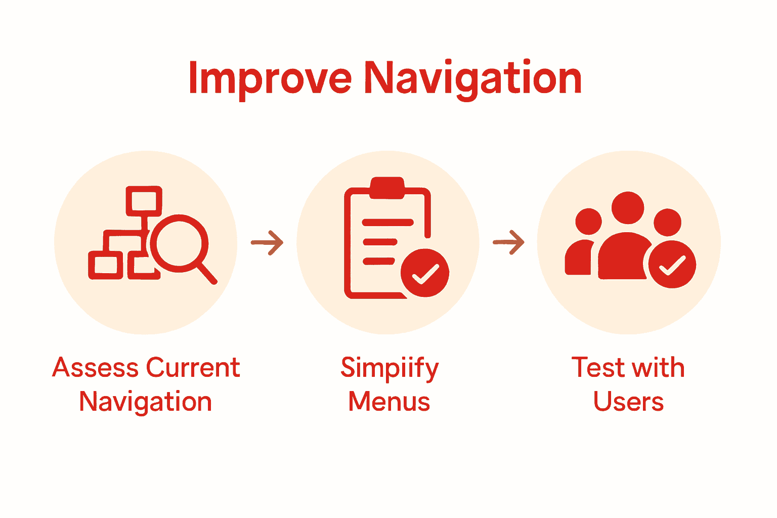
| 1. Assess Current Navigation | Evaluate your website’s existing navigation to identify user pain points and potential areas for improvement. |
| 2. Simplify Menu Structure | Reduce complexity in your menu by using clear, action-oriented labels and limiting the number of links for better readability. |
| 3. Organise Content Logically | Group related content into intuitive categories that reflect user mental models for easier navigation. |
| 4. Integrate Clear Calls to Action | Use specific, engaging prompts that guide users towards desired actions while enhancing the overall user experience. |
| 5. Test with Real Users | Conduct usability testing to observe real user interactions and gather insightful feedback to refine navigation. |
Step 1: Assess existing navigation structure
Decoding your website’s current navigation structure requires a systematic yet user-focused approach. According to University of Minnesota, evaluating your site’s navigation involves understanding how users actually perceive and interact with your current menu system.
To begin this assessment, conduct a comprehensive content inventory that maps out every single page and section of your website. Use techniques like card sorting, where you present users with content categories and ask them to organise these into logical groups. This method reveals precisely how your audience thinks about your site’s information hierarchy. As Open Berkeley recommends, pair this with user interviews to gain deeper insights into navigation challenges.
A practical tip for your assessment: create a visual sitemap that shows all current pages and their relationships. Look for areas where users might get lost or confused navigation paths. Are menus overly complex? Do some important pages require multiple clicks to reach? Your goal is to identify friction points that could frustrate potential visitors and streamline the user journey.
Once you have a clear picture of your current navigation structure, you’ll be ready to start redesigning with user experience as your primary focus.
Step 2: Simplify menu layout and language
Transforming your website’s navigation into an intuitive, user friendly experience starts with radical simplification. YaleSites emphasises creating menus that genuinely support user journeys, which means stripping away unnecessary complexity and focusing on meaningful, direct communication.
Begin by critically reviewing your current menu labels. Replace vague terminology with clear, action oriented language that instantly communicates what users will find. According to Purchase College, your navigation lists should remain concise, ideally containing no more than 6 to 8 links. This approach ensures readability and prevents overwhelming your visitors with too many options. Consider grouping related pages under broader, more intuitive category headings that reflect how your audience naturally thinks about your content.
A practical strategy is to physically map out your menu structure on paper or a digital whiteboard, treating each link like a potential user pathway. Eliminate redundant links, consolidate similar sections, and prioritise the most important user actions. Your goal is to create a menu that feels like an intuitive conversation guiding visitors exactly where they want to go with minimal cognitive effort.
With a simplified, user-centred menu structure, you are now ready to refine the visual design and ensure seamless navigation across your website.

Step 3: Organise content with logical categories
Creating a robust content structure that feels natural and intuitive is like designing a map that guides users effortlessly through your digital landscape. Harvard Digital Accessibility emphasises the critical importance of consistent navigation regions that help all users locate information efficiently, particularly those with specific accessibility requirements.
Start by thinking about your content as a comprehensive ecosystem. According to University of Alaska Southeast, your file structures and site navigation should mirror how users naturally think about information. Group related content into clear, meaningful categories that reflect your audience’s mental models. For instance, if you run a mission led business website, you might create top level categories like ‘Services’, ‘Impact’, ‘Resources’, and ‘About Us’ that intuitively capture your organisation’s essence.
A practical tip is to conduct a content audit where you physically map out all existing pages and ruthlessly evaluate their current categorisation. Look for opportunities to consolidate similar content, eliminate redundant pages, and create clear hierarchical relationships between different sections. Your goal is to build a navigation structure so logical that users can find exactly what they need with minimal cognitive effort.
With your content now thoughtfully organised, you are prepared to create a navigation system that feels like a seamless, intuitive conversation with your audience.
Step 4: Integrate clear calls to action and signposts
Transforming your website into an intuitive navigation experience means creating crystal clear pathways that guide users precisely where they need to go. University of Rhode Island emphasises that effective digital communication hinges on strategically placed calls to action that illuminate the next steps for your visitors.
Designing compelling calls to action requires thinking like your audience. According to Arizona State University, consistent navigation elements are crucial for enhancing user experience and accessibility. Focus on using action oriented language that speaks directly to user needs. Instead of passive phrases like ‘Learn More’, craft specific, engaging prompts such as ‘Explore Our Sustainable Services’ or ‘Start Your Impact Journey’. These signposts should stand out visually while remaining harmoniously integrated with your overall design, using contrasting colours and clear, legible typography.
A practical strategy is to map out your user’s potential journey and place calls to action at critical decision points. Consider what your visitors truly want to accomplish and create signposts that feel like helpful guideposts rather than pushy sales tactics. Ensure each call to action provides clear value and connects logically to the surrounding content.
With strategic calls to action now seamlessly woven into your navigation, you are ready to create a website that feels like an intuitive conversation with your audience. Explore our sustainable web design services to see these principles in action.
Step 5: Test navigation usability with real users
Validating your website’s navigation isn’t about guesswork it’s about understanding how actual users interact with your digital space. North Carolina State University Libraries pioneered an approach of recruiting participants to complete specific tasks, revealing genuine insights into navigation effectiveness.
According to University of Minnesota, comprehensive navigation testing involves two powerful techniques: card sorting and tree testing. Card sorting allows participants to organise content categories intuitively, while tree testing evaluates how easily users can find information within your proposed structure. Recruit a diverse group of 5 to 8 participants representing your target audience demographic. Prepare clear, realistic tasks that mirror genuine user goals like finding specific information or completing a transaction.
A practical tip is to think of usability testing as a conversation with your audience. Observe participants silently, taking detailed notes about where they hesitate, get confused, or navigate successfully. Record screen interactions if possible, but prioritise understanding the ‘why’ behind their navigation choices. Look for patterns of struggle that indicate potential redesign opportunities.
With usability insights gathered, you’re now equipped to refine your website’s navigation into a truly user centred experience.
VIDEO:video_content] [Explore our sustainable web design services to see expert navigation principles in action.
Step 6: Refine and monitor navigation performance
Turning your website’s navigation from good to exceptional requires ongoing attention and strategic analysis. University of Rhode Island emphasises that continuous monitoring of web activity provides crucial insights into how users truly interact with your digital platform.
According to Open Berkeley, creating a robust performance tracking system involves establishing clear metrics and reviewing your content structure regularly. Start by setting up comprehensive web analytics that track key navigation metrics such as time spent on pages, click through rates, and user flow paths. Pay special attention to pages with high bounce rates or unusual user behaviour these are potential indicators of navigation challenges. Implement heat mapping tools to visualise exactly where users click, scroll, and potentially get stuck in your navigation journey.
A practical strategy is to schedule quarterly navigation performance reviews. During these sessions, compare your current analytics against your original navigation goals. Look for emerging patterns such as new user preferences or shifts in content consumption. Be prepared to make incremental adjustments rather than wholesale changes this approach allows you to fine tune your navigation while maintaining a consistent user experience.
With a systematic approach to monitoring and refining your website’s navigation, you are now equipped to create a dynamic digital environment that continually adapts to your audience’s needs. Explore our sustainable web design services to see how expert navigation principles can transform your online presence.

Enhance Your Website Navigation for Unmatched User Experience
Navigating the complexities of website structure can be overwhelming when your users face confusing menus or unclear calls to action. This article highlights crucial challenges such as simplifying menu language, organising content logically and integrating clear signposts to reduce visitor frustration and enhance engagement. Businesses driven by meaningful missions cannot afford to lose potential supporters due to navigation friction or user confusion.
At Marzipan, we understand the emotional impact of a website that feels intuitive and seamless to your audience. We specialise in building sustainable websites tailored for mission led businesses, combining clean design with strategic navigation structures that truly guide your visitors. Whether refining your calls to action or ensuring logical content groupings, our expert team works with you to transform navigation pain points into effortless user journeys.
Take the next step towards a website that invites visitors in and keeps them exploring. Discover how our sustainable web design services apply these principles for measurable results.

Ready to transform your website navigation and captivate your audience now Visit Marzipan to start your impact journey today.
Frequently Asked Questions
How can I assess my current website navigation structure?
To assess your current website navigation structure, conduct a comprehensive content inventory that maps out all pages. Additionally, use techniques like card sorting and user interviews to understand how users perceive your menu system.
What steps can I take to simplify my website’s menu layout?
To simplify your website’s menu layout, critically review your menu labels and replace vague terms with clear, action-oriented language. Aim for 6 to 8 concise links that reflect how your audience thinks about your content.
How should I organise content categories for better navigation?
To organise content categories effectively, group related content into meaningful categories that resonate with users’ mental models. Conduct a content audit to evaluate and consolidate pages, ensuring users can find what they need quickly and logically.
How do I integrate effective calls to action in my navigation?
Integrate effective calls to action by using clear and engaging language that directly addresses user needs. Place these calls at critical decision points in the user journey to guide visitors naturally toward their goals.
What methods can I use to test the usability of my website’s navigation?
You can test the usability of your website’s navigation by conducting usability tests where participants complete specific tasks. Focus on observing where they hesitate or get confused to gather genuine insights into navigation effectiveness.
How can I monitor the performance of my website’s navigation?
To monitor navigation performance, set up web analytics to track key metrics such as time spent on pages and click-through rates. Schedule quarterly reviews to assess this data and adjust your navigation based on emerging patterns in user behaviour.
