
More than 50 percent of internet users in British households now access websites through multiple devices every day. As browsing habits shift and screen sizes multiply, delivering a consistent experience has become critical for businesses and everyday users alike. Whether you are launching a new brand or managing an established site, understanding how responsive design works can help you meet the demands of modern audiences and ensure your website remains effective, inclusive, and future-proof.
Table of Contents
- Responsive Design Explained For Modern Websites
- Types Of Responsive Strategies And Layouts
- Impact On User Experience And Accessibility
- Seo, Sustainability, And Ethical Considerations
- Comparing Responsive Vs. Alternative Approaches
Key Takeaways
| Point | Details |
|---|---|
| Responsive Design is Essential | Websites must function seamlessly across devices to enhance user experience and engagement. |
| Accessibility is Key | Responsive design helps improve usability for all users, including those with assistive technologies. |
| Benefits of a Unified Approach | Using a single codebase reduces maintenance costs and ensures consistent branding across platforms. |
| Strategic Necessity for Businesses | Implementing responsive design reflects a commitment to modern digital practices and user expectations. |
Responsive Design Explained for Modern Websites
Responsive design represents a fundamental approach to web development that ensures websites function seamlessly across multiple devices and screen sizes. At its core, responsive web design adapts content dynamically, providing an optimal viewing experience whether users access a site from a smartphone, tablet, or desktop computer.
The technical foundation of responsive design relies on three primary components: fluid grids, flexible images, and media queries. Responsive design principles from Stanford University highlight how these elements work together to create adaptable web experiences. Fluid grids allow layouts to proportionally resize, flexible images scale appropriately, and media queries enable different styling rules based on device characteristics.
Accessibility stands as a critical consideration in responsive design. According to Clemson University’s digital accessibility guide, responsive techniques particularly benefit users with low vision by allowing content to adjust dynamically to different screen sizes and zoom levels. This approach ensures that websites remain readable and functional for all users, regardless of their device or assistive technology requirements.
For Australian brands, implementing responsive design isn’t just a technical choice—it’s a strategic necessity. With increasing mobile internet usage and diverse device preferences, websites must deliver consistent, high-quality experiences across platforms. By prioritising responsive techniques, businesses can improve user engagement, reduce bounce rates, and create more inclusive digital interactions that meet the expectations of modern consumers.
Types of Responsive Strategies and Layouts
Responsive web design encompasses several sophisticated strategies that enable websites to adapt seamlessly across different devices and screen sizes. Key responsive design strategies outlined by Kennesaw State University highlight the critical approaches that web designers employ to create flexible, dynamic layouts that maintain functionality and aesthetic appeal.
The primary responsive strategies include fluid grid systems, flexible image techniques, and media query implementations. Fluid grids use relative sizing units like percentages instead of fixed pixel measurements, allowing content to proportionally resize across different screen dimensions. Flexible images are configured to scale within their containing elements, preventing overflow or distortion. Media queries enable designers to apply specific CSS rules based on device characteristics such as screen width, resolution, and orientation.
Additionally, Harvard University’s documentation on responsive design reveals multiple layout approaches that web designers can leverage. These include mobile-first design, where websites are initially constructed for mobile interfaces and then progressively enhanced for larger screens, and adaptive design, which uses predefined layout breakpoints to serve different page versions based on device specifications. Responsive layouts typically fall into three primary categories: single-column layouts ideal for mobile devices, multi-column grid systems for tablets, and complex, asymmetrical designs for desktop environments.
For Australian brands seeking to implement responsive strategies, understanding these layout techniques is crucial. By carefully selecting appropriate responsive approaches, businesses can ensure their digital presence remains consistent, accessible, and engaging across smartphones, tablets, laptops, and desktop computers. The goal is not merely technical adaptation but creating meaningful, user-centric web experiences that reflect the brand’s commitment to modern digital communication.
Impact on User Experience and Accessibility
Responsive design fundamentally transforms how users interact with digital content by creating seamless, adaptable experiences across different devices. Accessibility strategies from Elon University underscore the critical importance of designing websites that function effectively for all users, including those relying on assistive technologies.
The user experience benefits of responsive design extend far beyond visual aesthetics. By implementing flexible layouts and adaptable interfaces, websites can dramatically improve navigation, readability, and interaction for users across various devices. Users with different accessibility needs, including those using screen readers or alternative input methods, can navigate content more intuitively when websites are constructed with responsive principles. These design approaches ensure that text remains legible, touch targets are appropriately sized, and interactive elements remain functional regardless of screen size or device type.

Moreover, research from the University of Texas at Tyler highlights how responsive design significantly enhances user engagement by providing a consistent experience across platforms. This approach eliminates the need for multiple website versions and reduces cognitive load for users who switch between devices. For Australian businesses, this means creating digital experiences that are not just visually appealing but genuinely inclusive and user-centric.
The practical implications of responsive design for accessibility are profound. By prioritising flexible layouts, scalable typography, and device-agnostic interfaces, brands can ensure their digital presence remains welcoming and functional for all users. This approach goes beyond technical compliance, representing a commitment to creating digital experiences that respect diversity, accommodate different user needs, and reflect a modern, empathetic approach to web design.
SEO, Sustainability, and Ethical Considerations
Responsive web design represents a holistic approach that extends beyond visual aesthetics, intersecting critical domains of search engine optimization, environmental sustainability, and digital ethics. Research from Emory University demonstrates how responsive design can significantly enhance search engine performance by maintaining a unified URL structure across multiple devices, which search engines inherently prefer and reward with improved rankings.
The sustainability implications of responsive design are profound. By eliminating the need for multiple website versions and reducing computational overhead, responsive approaches contribute to reduced digital carbon footprints. Advanced styling research from the University of Michigan highlights how streamlined, single-codebase approaches minimise energy consumption associated with web infrastructure, presenting a more environmentally conscious digital strategy for forward-thinking Australian brands.
Ethical considerations sit at the heart of responsive design principles. This approach fundamentally champions digital inclusivity by ensuring websites remain accessible across diverse devices, screen sizes, and user capabilities. By prioritising flexible, adaptable interfaces, brands demonstrate a commitment to universal design that transcends technological barriers. Such an approach reflects a mature understanding that digital experiences should be welcoming and functional for all users, regardless of their technological resources or physical capabilities.
For Australian businesses, embracing responsive design is more than a technical decision—it represents a strategic commitment to sustainable, inclusive digital practices. By integrating SEO best practices, reducing environmental impact, and prioritising user accessibility, brands can create digital experiences that are not just aesthetically pleasing, but genuinely responsible and forward-thinking.
Comparing Responsive vs. Alternative Approaches
Responsive web design represents a sophisticated evolution in digital interface development, offering significant advantages over traditional web design methodologies. Comparative analysis from the University of Louisiana Monroe highlights the critical differences between responsive and fixed layout approaches, demonstrating how adaptive design fundamentally transforms user interaction across multiple devices.
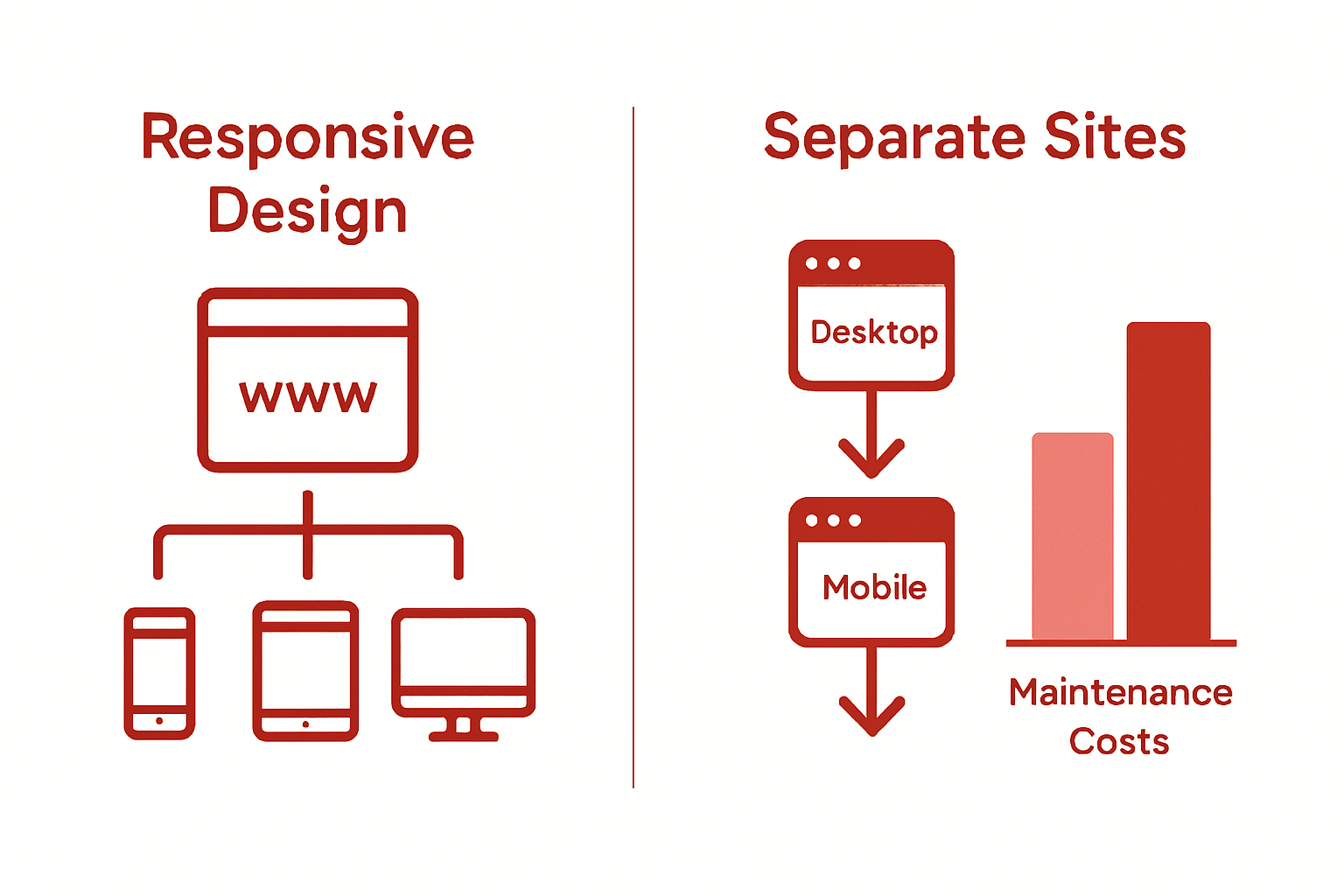
Traditional web design approaches typically involved creating separate websites for desktop and mobile platforms, which resulted in fragmented user experiences and increased maintenance complexity. Research from the F.I.R.S.T. Institute contrasts this approach with responsive design, which utilises a single, flexible codebase that dynamically adjusts to different screen sizes and device characteristics. This method eliminates the need for multiple site versions, reducing development time, maintenance costs, and potential inconsistencies in content and user experience.
The key differentiators between responsive and alternative web design approaches become particularly evident when examining performance, user experience, and technical efficiency. Alternative methods like adaptive design or separate mobile sites require developers to manage multiple codebases, whereas responsive design provides a unified solution that adapts seamlessly. This approach ensures consistent branding, faster load times, and a more intuitive navigation experience across smartphones, tablets, laptops, and desktop computers.
For Australian businesses, selecting the right web design approach is more than a technical decision—it represents a strategic commitment to digital excellence. Responsive design offers unparalleled flexibility, enabling brands to create digital experiences that are not just visually appealing, but genuinely user-centric and technologically sophisticated. By embracing this approach, organisations can ensure their digital presence remains agile, accessible, and aligned with evolving user expectations and technological landscapes.
Elevate Your Australian Brand with Ethical, Performance-Driven Responsive Design
Building a website that truly resonates with your audience means embracing the responsive design principles highlighted in this article. Australian brands face the critical challenge of delivering seamless, accessible digital experiences across all devices while aligning with values like sustainability and inclusivity. At Marzipan, we understand the importance of fluid grids, flexible images and media queries as not just technical tools but essential elements that enhance user experience, improve SEO and reduce environmental impact.
Discover how our expertise in ethical AI, sustainable web design and performance-driven SEO strategies can help your purpose-driven business build a website that performs brilliantly without compromising your values. Visit us at Marzipan to start your journey. Take the step now to create a responsive, accessible and impactful digital presence that Australian consumers trust and engage with.
Frequently Asked Questions
What is responsive design?
Responsive design is a web development approach that ensures websites provide an optimal viewing experience across various devices and screen sizes by dynamically adapting content.
Why is responsive design important for user experience?
Responsive design enhances user experience by improving navigation, readability, and interaction, making websites accessible and functional for users on smartphones, tablets, and desktops.
What are the main components of responsive design?
The main components of responsive design include fluid grids, flexible images, and media queries, which work together to create adaptable web experiences.
How does responsive design affect SEO?
Responsive design can enhance SEO performance by maintaining a unified URL structure across devices, which search engines prefer and reward with improved rankings.
Recommended
- Mobile-Friendly Web Design: Complete Guide for Australia – Marzipan
- Understanding the Website Branding Process in Australia
- Responsive Web Design Guide: Complete Overview – Marzipan
- Complete Guide to Website Design Trends 2025 – Marzipan
- 7 Key Digital Marketing Trends 2025 for Malaysian Buyers – Projector Display