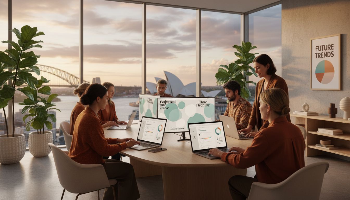
Most website visitors decide whether to stay or leave in less than 10 seconds, making every design choice crucial for Sydney businesses determined to stand out. With the growing influence of british design trends and a sharp focus on sustainability, accessibility, and lightning-fast performance, the best web practices today blend style with substance. Discover how these modern approaches can shape digital experiences that attract, engage, and truly resonate with your audience.
Table of Contents
- 1. Embracing Sustainable Web Design Practices
- 2. Prioritising Accessibility For All Users
- 3. Utilising Bold Typography And Colour Schemes
- 4. Implementing Advanced Mobile Responsiveness
- 5. Leveraging AI-Powered Personalisation Features
- 6. Focusing On Fast Page Load And Performance
- 7. Blending Local Sydney Flair Into Visual Elements
Quick Summary
| Key Insight | Detailed Explanation |
|---|---|
| 1. Prioritise Sustainable Design | Embrace energy efficiency by selecting lightweight architecture and green hosting to reduce carbon footprints. |
| 2. Enhance Accessibility Measures | Implement strategies like clear contrast and keyboard navigation to welcome all users, particularly those with disabilities. |
| 3. Utilise Bold Typography and Colour | Choose distinct typography and colour palettes that reflect brand identity while ensuring readability and emotional impact. |
| 4. Ensure Mobile Responsiveness | Design websites with mobile-first principles to enhance functionality across various devices and screen sizes. |
| 5. Integrate AI for Personalisation | Use artificial intelligence to adapt website content based on user behaviour, providing a tailored digital experience. |
1. Embracing Sustainable Web Design Practices
Sustainable web design represents a transformative approach that minimises digital environmental impact while delivering exceptional user experiences. By prioritising energy efficiency and thoughtful digital infrastructure, Sydney businesses can create websites that are both ecologically responsible and high performing.
The core principle of sustainable web design centres on reducing digital carbon footprints through strategic technological choices. This means designing websites that consume less computational energy, require minimal data transfer, and operate with maximum efficiency. Modern web designers are increasingly recognising that every kilobyte of data transmitted contributes to global carbon emissions.
Practical implementation starts with lightweight website architecture. This involves selecting optimised images, writing clean code, minimising server requests, and choosing green hosting providers. For instance, compressing images to under 100 kilobytes, utilising vector graphics where possible, and streamlining CSS and JavaScript can dramatically reduce a website’s energy consumption.
Key strategies for sustainable web design include:
- Minimalist Design: Reduce visual complexity and unnecessary graphical elements
- Performance Optimisation: Faster loading times mean less energy consumption
- Green Hosting: Select data centres powered by renewable energy
- Efficient Coding: Write lean, purpose driven code that minimises computational work
Businesses can further enhance their sustainable web approach by exploring green web design principles that balance aesthetic quality with environmental responsibility. By making conscious design choices, organisations can contribute to global sustainability efforts while maintaining exceptional digital experiences.
2. Prioritising Accessibility for All Users
Accessibility in web design transcends mere compliance. It represents a fundamental commitment to creating digital experiences that welcome and empower every user, regardless of their physical abilities or technological constraints.
In the evolving digital landscape, inclusive design has become a critical consideration for businesses. The Web Content Accessibility Guidelines provide a comprehensive framework for developing websites that accommodate diverse user needs, ensuring that digital platforms remain open and navigable for individuals with visual, auditory, motor, and cognitive differences.
Practical accessibility strategies extend far beyond basic screen reader compatibility. They involve thoughtful design choices that create seamless user experiences. This might include implementing clear colour contrast ratios, providing alternative text for images, ensuring keyboard navigation functionality, and designing intuitive interface layouts that support multiple interaction methods.
Key accessibility principles for Sydney businesses include:
- Colour and Contrast: Ensure sufficient colour contrast for readability
- Keyboard Navigation: Enable full website interaction without mouse use
- Alternative Text: Describe images for screen reader users
- Clear Typography: Use legible fonts and appropriate text sizing
- Multimedia Captions: Provide subtitles and transcripts for audio visual content
By integrating these accessibility considerations, businesses not only expand their potential user base but also demonstrate a profound commitment to digital inclusivity. The result is a more equitable online environment that respects and accommodates the diverse ways people interact with digital platforms.
3. Utilising Bold Typography and Colour Schemes
Typography and colour are more than aesthetic choices. They are powerful communication tools that shape user perception, emotional engagement, and brand storytelling in digital experiences. By carefully selecting fonts and colour palettes, businesses can create visually compelling websites that capture attention and convey brand personality.
Modern web design emphasises bold typographic approaches that break traditional design conventions. This means moving beyond standard fonts and exploring typefaces that are distinctive, readable, and reflective of brand identity. Large, dramatic headings, variable font weights, and strategic text sizing can transform how users interact with digital content.
Colour scheme selection goes far beyond personal preference. It involves understanding colour psychology, brand positioning, and accessibility standards. Web Content Accessibility Guidelines recommend specific contrast ratios to ensure readability for users with visual impairments, making colour an essential consideration for inclusive design.
Key strategies for effective typography and colour design include:
- Contrast and Readability: Ensure text stands out against background colours
- Brand Consistency: Use colour palettes that reflect organisational identity
- Emotional Impact: Select colours that evoke desired user feelings
- Responsive Typography: Adapt font sizes for different screen dimensions
- Minimalist Colour Approach: Use limited, purposeful colour ranges
By thoughtfully integrating typography and colour, businesses can create digital experiences that are not just visually striking but also emotionally resonant and functionally inclusive.
4. Implementing Advanced Mobile Responsiveness
Mobile responsiveness has transcended from being a design preference to a fundamental digital necessity. With over 80% of internet users accessing content through mobile devices, businesses must create websites that seamlessly adapt across multiple screen sizes and technological platforms.
Advanced mobile responsiveness goes beyond simple screen scaling. Mobile first design principles require developers to prioritise mobile user experience during the initial design phase, ensuring content remains functional and visually appealing on smartphones and tablets.
Technical implementation involves sophisticated strategies drawn from comprehensive responsive design guidelines. These include flexible grid layouts, adaptive images, and intelligent CSS media queries that dynamically adjust content presentation based on device characteristics.
Key strategies for superior mobile responsiveness include:
- Flexible Grid Systems: Create layouts that proportionally resize
- Adaptive Image Techniques: Use responsive image formats
- Touch Friendly Interface: Design larger interactive elements
- Performance Optimisation: Minimise loading times on mobile networks
- Cross Device Compatibility: Test across multiple device types
By embracing advanced mobile responsiveness, businesses can create digital experiences that feel intuitive, engaging, and professionally crafted across every possible device and screen dimension.
5. Leveraging AI-Powered Personalisation Features
Artificial intelligence has transformed website interactions from generic experiences to intelligent, adaptive digital environments. Modern businesses can now create websites that dynamically respond to individual user preferences, behaviour patterns, and specific needs.
Personalisation strategies have evolved beyond simple name insertions. AI-powered personalisation techniques enable websites to deliver contextually relevant content, recommendations, and user interfaces that feel uniquely tailored to each visitor’s characteristics and interaction history.
Advanced personalisation incorporates sophisticated machine learning algorithms that analyse user data in real time. These systems can predict user intentions, adjust content presentation, and create seamless navigation experiences that feel intuitive and engaging.
Key strategies for implementing AI personalisation include:
- Behavioural Tracking: Understand individual user interaction patterns
- Dynamic Content Adaptation: Modify website elements based on user preferences
- Predictive Recommendations: Suggest relevant content or products
- Contextual User Interfaces: Adjust design based on device and user context
- Intelligent Search Functionality: Provide more accurate, personalised search results
By integrating intelligent personalisation features, businesses can create digital experiences that feel remarkably human, responsive, and attentive to individual user needs.
6. Focusing on Fast Page Load and Performance
Website performance represents the digital heartbeat of modern businesses. Users expect instantaneous interactions, with even a single second of delay potentially costing valuable engagement and potential conversions.
Performance scoring metrics reveal that websites loading within two seconds retain approximately 87% of users, while slower sites experience exponential drop off rates. This underscores the critical importance of optimising website speed across all digital platforms.
Technical performance goes beyond mere loading times. Modern web development requires intelligent strategies that minimise computational work, reduce data transfer, and create seamless user experiences. Implementing smart caching mechanisms, compressing resources, and utilising modern web technologies can dramatically improve website responsiveness.
Key strategies for superior website performance include:
- Image Optimisation: Compress and resize images intelligently
- Minimal Code Approach: Write lean, efficient programming code
- Browser Caching: Store frequently used resources locally
- Content Delivery Networks: Distribute website assets geographically
- Asynchronous Resource Loading: Prioritise critical content first
By prioritising performance, businesses can create digital experiences that feel instantaneous, professional, and respectful of user time and technological resources.
7. Blending Local Sydney Flair into Visual Elements
Web design offers a unique opportunity to celebrate local cultural identity through visual storytelling. For Sydney businesses, this means creating digital experiences that authentically reflect the city’s vibrant, multicultural spirit and distinctive architectural landscape.
Visual design elements can subtly incorporate Sydney’s unique characteristics. Website branding strategies allow businesses to weave local visual narratives that resonate with regional audiences while maintaining professional design standards.
Drawing inspiration from Sydney’s rich cultural tapestry involves strategic visual choices. This might include colour palettes reminiscent of harbour landscapes, typography that echoes urban architectural lines, or imagery that captures the city’s dynamic energy and diverse community spirit.
Key strategies for incorporating local Sydney visual elements include:
- Colour Palettes: Use harbour blues, sandstone yellows, and native greenery tones
- Photography: Showcase local landmarks and urban environments
- Typography: Select fonts that reflect Sydney’s architectural character
- Graphic Elements: Incorporate subtle references to local cultural icons
- Imagery Style: Capture the multicultural essence of Sydney’s community
By thoughtfully integrating local visual narratives, businesses can create websites that feel simultaneously professional and authentically connected to Sydney’s unique cultural landscape.
Below is a comprehensive table summarising the key strategies and principles discussed in the article on sustainable web design, accessibility, and other modern web development techniques.
| Topic | Description | Key Considerations |
|---|---|---|
| Sustainable Web Design | Focus on reducing digital carbon footprint through energy efficiency. | Lightweight architecture, minimalist design, performance optimisation, green hosting |
| Accessibility | Create inclusive digital experiences for all users. | Colour contrast, keyboard navigation, alternative text, clear typography, captions |
| Typography and Colour | Use typography and colour for communication and emotional engagement. | Contrast, brand consistency, emotional impact, responsive typography, minimalist palette |
| Mobile Responsiveness | Ensure websites adapt seamlessly across devices. | Flexible grids, adaptive images, touch-friendly interfaces, performance optimisation |
| AI-Powered Personalisation | Use AI to deliver personalised digital experiences. | Behavioural tracking, dynamic content, predictive recommendations, contextual interfaces |
| Fast Page Load and Performance | Optimise website speed and user interaction times. | Image optimisation, minimal code, browser caching, CDNs, asynchronous loading |
| Local Sydney Flair | Incorporate local cultural identity in visual designs. | Colour palettes, local photography, typography, graphic elements, imagery style |
Elevate Your Sydney Business with Sustainable and Inclusive Web Design
Sydney businesses face the dual challenge of creating websites that are not only visually striking but also sustainable, accessible and high performing. The article on 7 Essential Web Design Trends 2025 highlights critical goals such as reducing digital carbon footprints through green hosting and energy efficient coding, prioritising comprehensive accessibility for all users and ensuring advanced mobile responsiveness that adapts flawlessly across devices. These demands can feel overwhelming but are vital for meeting user expectations and demonstrating social responsibility.
At Marzipan we specialise in building sustainable websites tailored for mission led organisations. We combine cutting edge techniques like AI powered personalisation and fast page load optimisation to create seamless experiences that captivate and convert. Our approach respects both environmental impact and inclusive access so your Sydney business stands out ethically and effectively. Learn how we apply these principles through our strategic services like AI SEO solutions that harness data driven insights for your digital growth.
Take the leap now to future proof your online presence with sustainable, accessible and high performance web design crafted for Sydney’s unique landscape.
Discover more by visiting our main site and start transforming your website into a powerful asset today.
Ready to adopt the latest web design trends while honouring your mission? Contact us to discuss your project and benefit from expert solutions that deliver real impact and authentic user engagement.
Frequently Asked Questions
What are the key strategies for implementing sustainable web design?
To implement sustainable web design, focus on reducing the digital carbon footprint through lightweight architecture, performance optimisation, and green hosting. Start by compressing images and minimising server requests to reduce energy consumption effectively.
How can I ensure my website is accessible to all users?
Creating an accessible website involves following accessibility guidelines that include clear colour contrast, keyboard navigation, and alternative text for images. Review your site’s design and implement these accessibility features to reach a broader audience and demonstrate inclusivity.
What are the best practices for mobile responsiveness in web design?
To achieve mobile responsiveness, prioritise mobile user experience by employing flexible grid systems and adaptive images. Test your website across various devices to ensure all content is functional and visually appealing on smartphones and tablets.
How can I enhance user experience with AI-powered personalisation features?
AI-powered personalisation improves user experience by dynamically adjusting content based on individual preferences and behaviours. Integrate behavioural tracking and predictive recommendations to offer tailored content that engages users effectively.
How does fast page load impact website performance?
Fast page load significantly enhances user retention, as websites that load within two seconds retain about 87% of users. Take steps to optimise images and utilise browser caching to improve your site’s loading speed and overall performance.
What design elements should I incorporate to reflect local Sydney culture?
To reflect local Sydney culture, integrate visual elements like colour palettes inspired by the harbour and imagery depicting local landmarks. Use this local flair to create a website that feels authentically connected to the community while maintaining professionalism.